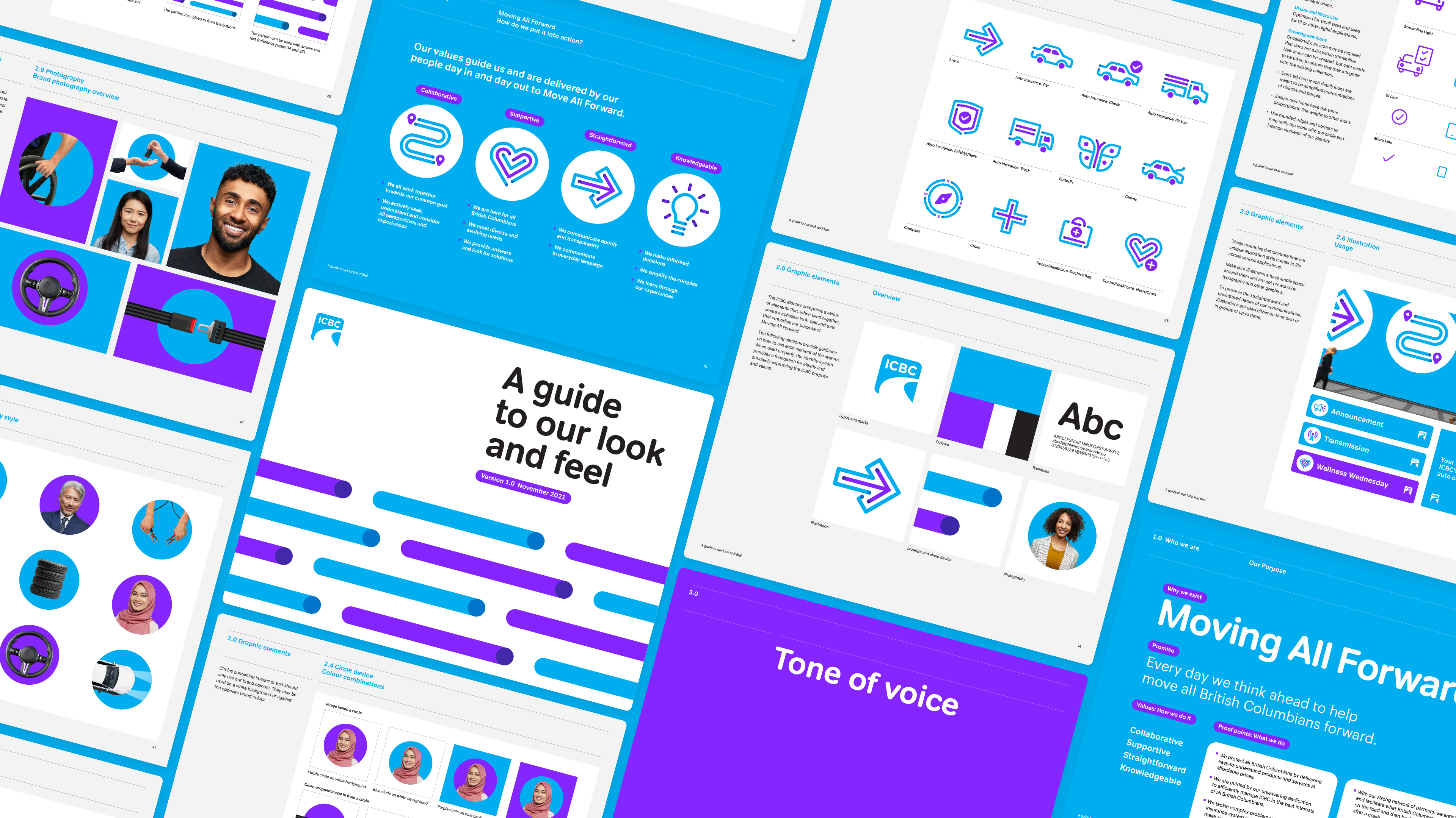
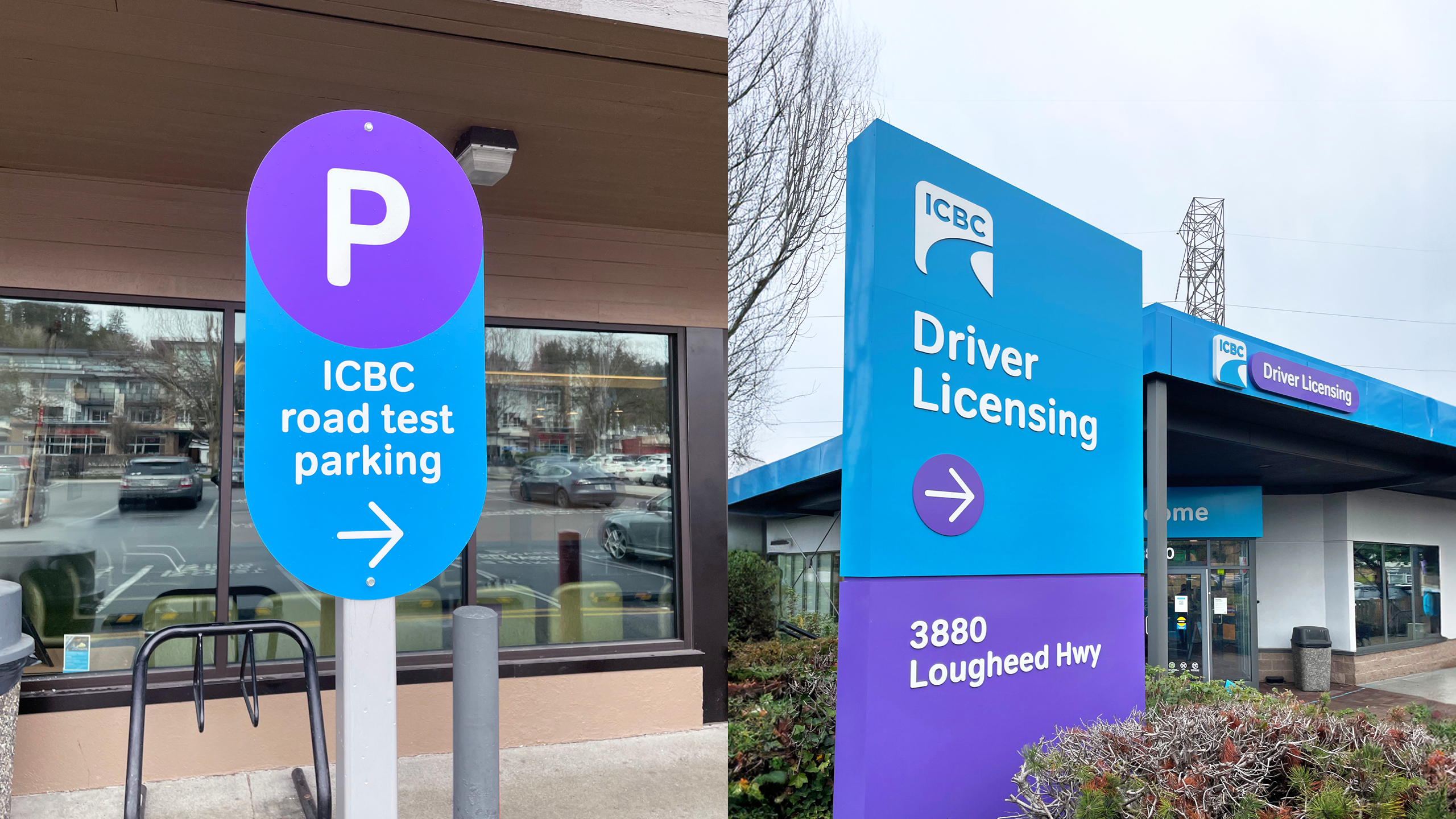
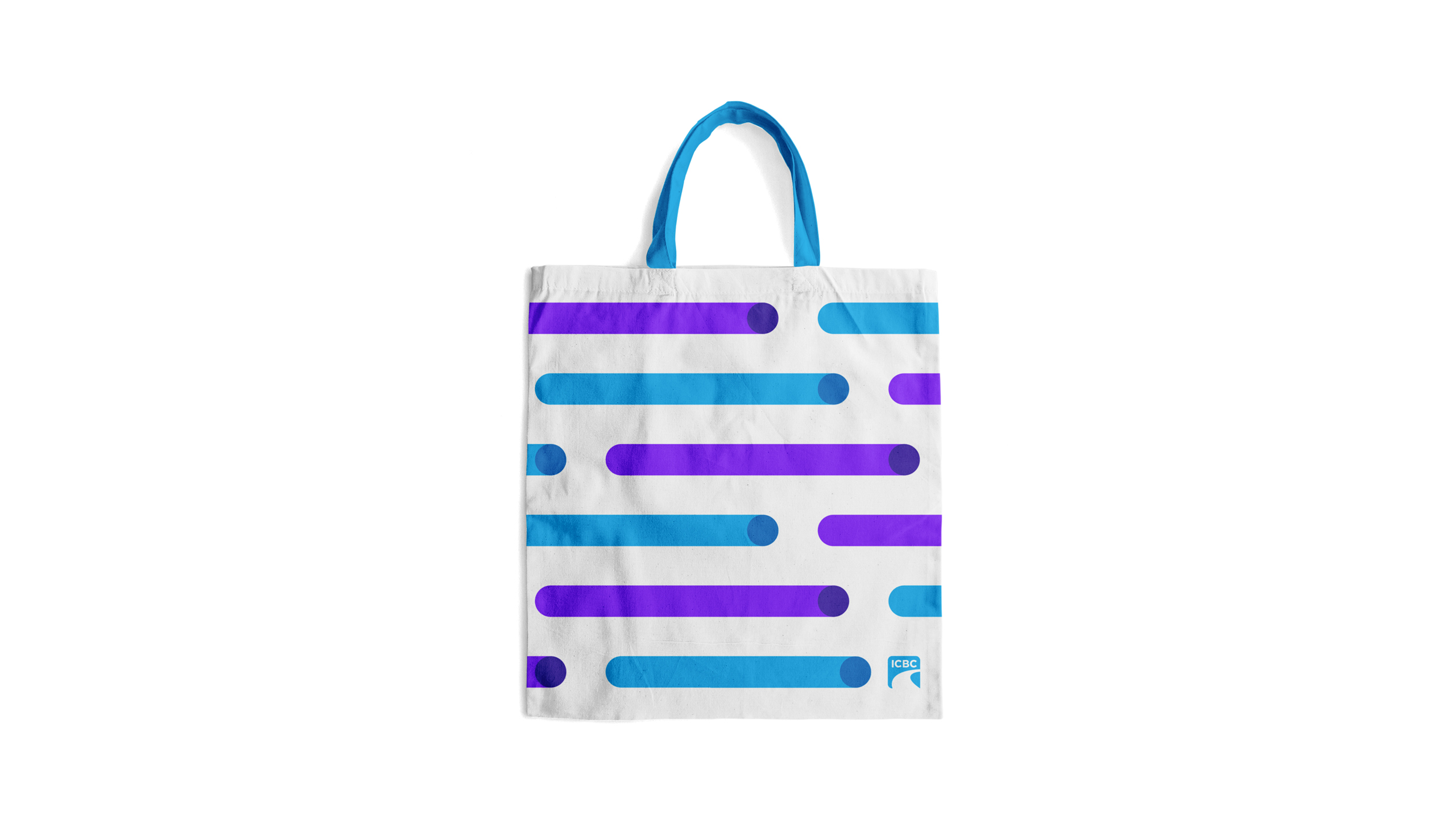
ICBC was going through a host of organizational changes and needed a new platform to unify their brand and bring their Purpose to life. The addition of purple differentiates ICBC from the slew of other BC brands defined by blue, and provides warmth and humanity, reflecting their role as a customer-centric organization. A core graphic device, a lozenge shape, reflects the forward-looking nature of the organization. The digital-first system lives across ICBC’s website, advertising and video content. The colours, graphic device and tone of voice have been extended throughout office interiors, and a signage system was developed for the exterior and interior of Driver Licensing and Claims Centres.
What we did
Brand planning, brand architecture, identity system, tone of voice, advertising, signage and environments, website consultation, employer brand